Can people use it on a phone? Mobile and accessibility checks
Review narrow screens, touch controls, keyboard access, zoom, contrast, image descriptions, forms and loading with eight practical illustrations.
Last updated
Official sources checked:
A page that looks good on a laptop may hide its menu or make a copy button difficult to use on a phone. Review the reader’s actual task. This initial check draws on W3C and web.dev guidance and does not replace a complete accessibility evaluation. The diagrams are illustrative. Record the devices and assistive technology used and leave untested coverage visible.
CHECK 01 / 8Does the layout fit a narrow screen?
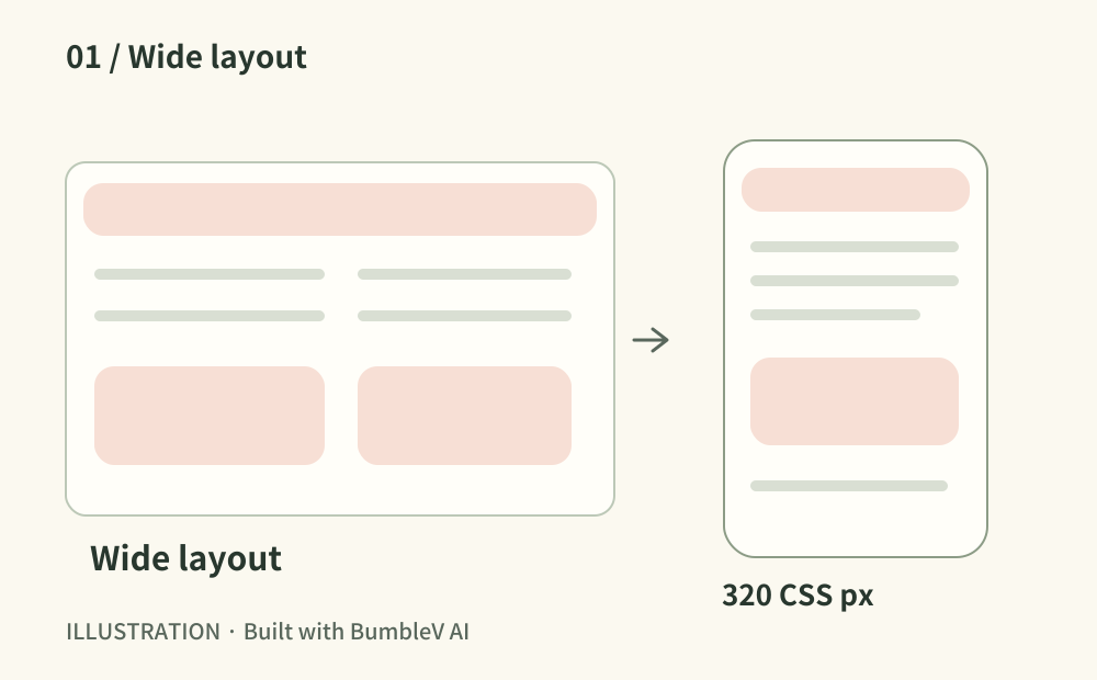
Open the home page, menu, long article and input flow on a phone. Also review a 320 CSS-pixel viewport. Long URLs and tables should not push the entire page sideways. Content such as a map may need two-dimensional interaction; surrounding text and controls should still fit. Try landscape orientation too.
- Where to look
- Physical phone · 320px responsive viewport · long text and tables
- When to tick this check
- Ordinary content and controls remain available without page-wide horizontal scrolling.
CHECK 02 / 8Are touch targets usable without precise tapping?
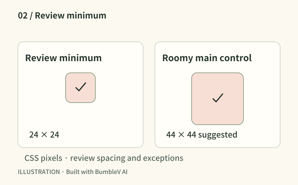
Try the menu, checkboxes, copy and Back controls with one hand. WCAG 2.2’s minimum target criterion uses 24 by 24 CSS pixels, with spacing conditions and exceptions. As a design recommendation, give primary controls a generous area around 44 by 44 and room between neighbours. Inspect the actual hit area, not just the icon.
- Where to look
- Phone controls · checkbox labels · inspected hit areas
- When to tick this check
- Hit areas and spacing have been reviewed and important controls work without accidental neighbouring taps.
CHECK 03 / 8Can a keyboard user complete the main flow?
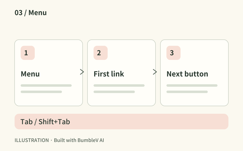
Put the mouse aside and move with Tab and Shift+Tab. Focus should stay visible and follow a sensible order. Activate links with Enter and buttons with Enter or Space. Open and close menus or dialogs and check where focus returns. Record any trap or off-screen focus.
- Where to look
- Published page · keyboard navigation · menus and dialogs
- When to tick this check
- Primary controls have visible focus and can be reached, used and exited by keyboard.
CHECK 04 / 8Does larger text preserve content and controls?
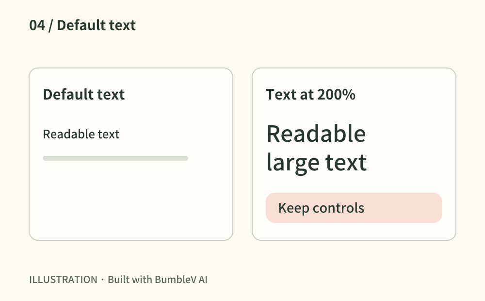
Review browser zoom and, where available, text-only resizing to 200%. Try a larger phone text setting as well. Look for wrapping menu labels, clipped buttons and overlapping messages. Prioritize long headings, copyable prompts and error instructions. Important text embedded only in an image can be difficult to enlarge usefully.
- Where to look
- 200% zoom · text resizing · long labels and instructions
- When to tick this check
- Enlarged text preserves the information and available functions without clipping or overlap.
CHECK 05 / 8Can readers distinguish text and status messages?
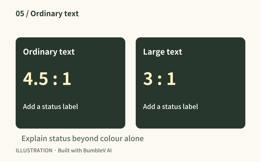
Measure foreground and background colours for body copy, dates, muted labels and buttons. Review 4.5:1 for ordinary text and 3:1 for qualifying large text. Check weak areas over photos or gradients. Give errors and completed states a textual or symbolic label as well as colour. Record measured values rather than relying on appearance alone.
- Where to look
- Contrast checker · text and buttons · status labels · image overlays
- When to tick this check
- Text contrast is measured and important states are understandable beyond colour alone.
CHECK 06 / 8Does important image information have an alternative?
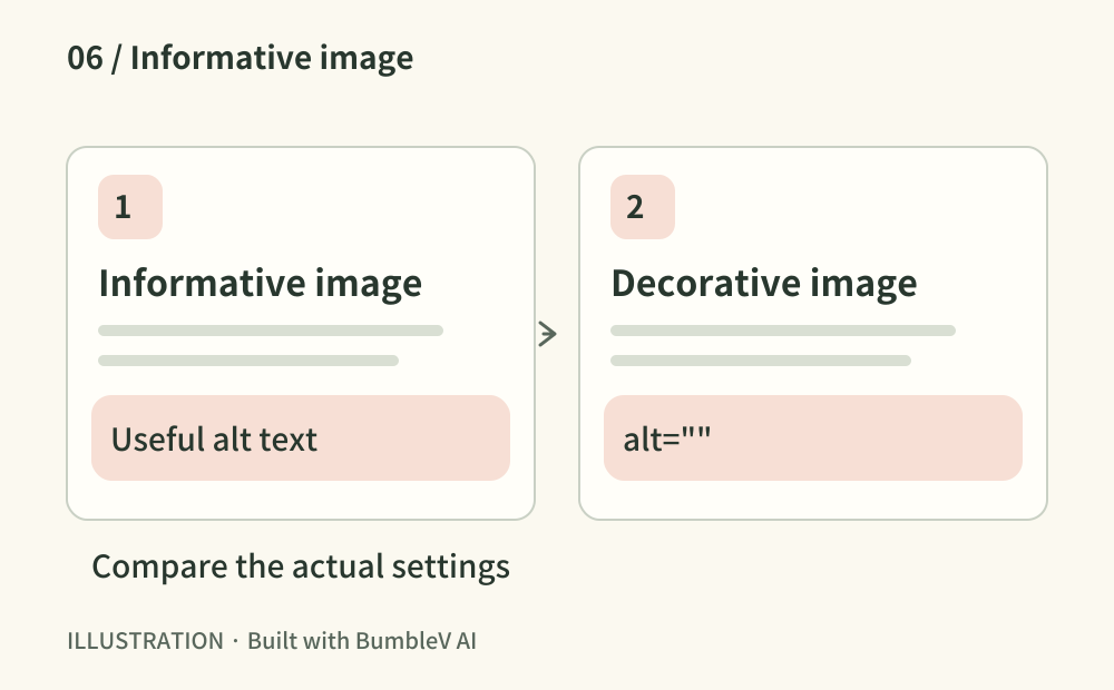
Read the alt text for an instructional image: explain the useful information rather than naming it “image1.” Use empty alt for decoration and an action name for an image control. Provide a nearby explanation or table for a complex chart. Review with a screen reader where available and remove needless repetition.
- Where to look
- Image alt text · image control names · surrounding explanations and tables
- When to tick this check
- Informative, decorative and functional images have appropriate alternatives and complex information is available in text.
CHECK 07 / 8Are errors and actual results understandable?
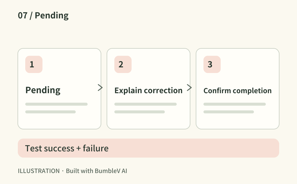
Test an empty, invalid and successful submission where forms exist. Inputs need visible names; errors should explain what to fix and where. Review pending, failed and completed messages with keyboard and screen-reader use. A copy control should report success only after copying succeeds. For a site without forms, test a comparable search or copy action.
- Where to look
- Form or comparable action · error, pending and completion feedback
- When to tick this check
- Success and failure have been tested and the next action and real outcome are clear.
CHECK 08 / 8Can readers use the page while it loads?
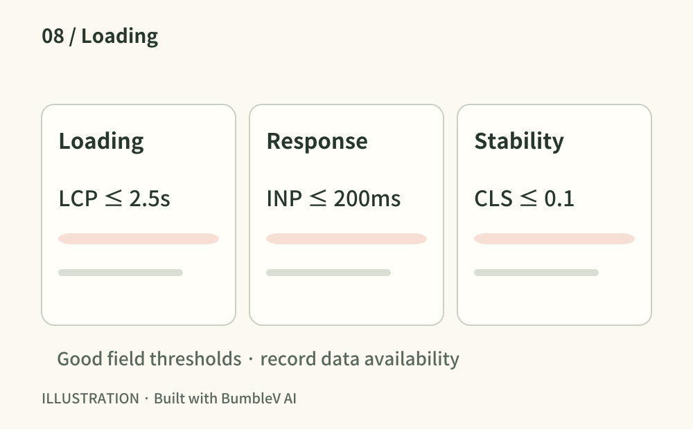
Run the public URL through PageSpeed Insights and review it on a phone. LCP describes loading, INP responsiveness and CLS visual stability. Good thresholds are at most 2.5 seconds, 200 milliseconds and 0.1 respectively, evaluated at the 75th percentile of field visits. Separate field data from a lab score; record when field data is unavailable. Watch for images or ads shifting controls during loading.
- Where to look
- PageSpeed Insights · physical phone · lab results and field data
- When to tick this check
- The environment and data coverage are recorded and loading delays or shifts affecting key tasks are reviewed.
Copy this prompt and paste it into your AI
Replace the placeholders with your URL, tools and current situation. Copy the full text into your AI to request all eight checks, verification of the public result and any remaining account tasks.
Sources & further reading
- https://www.w3.org/WAI/WCAG22/Understanding/reflow.html
- https://www.w3.org/WAI/WCAG22/Understanding/target-size-minimum.html
- https://www.w3.org/WAI/test-evaluate/preliminary/#interaction
- https://www.w3.org/WAI/WCAG22/Understanding/resize-text.html
- https://www.w3.org/WAI/WCAG22/Understanding/contrast-minimum.html
- https://www.w3.org/WAI/tutorials/images/
- https://www.w3.org/WAI/tutorials/forms/notifications/
- https://web.dev/articles/vitals