VectorCraft tutorial: build an app icon from simple shapes
A documented, six-step guide to build an app icon from simple shapes, with source screenshots, editable files and output checks.
Last updated
Menus and supported features can change. Compare the source-check date below with your current app version.
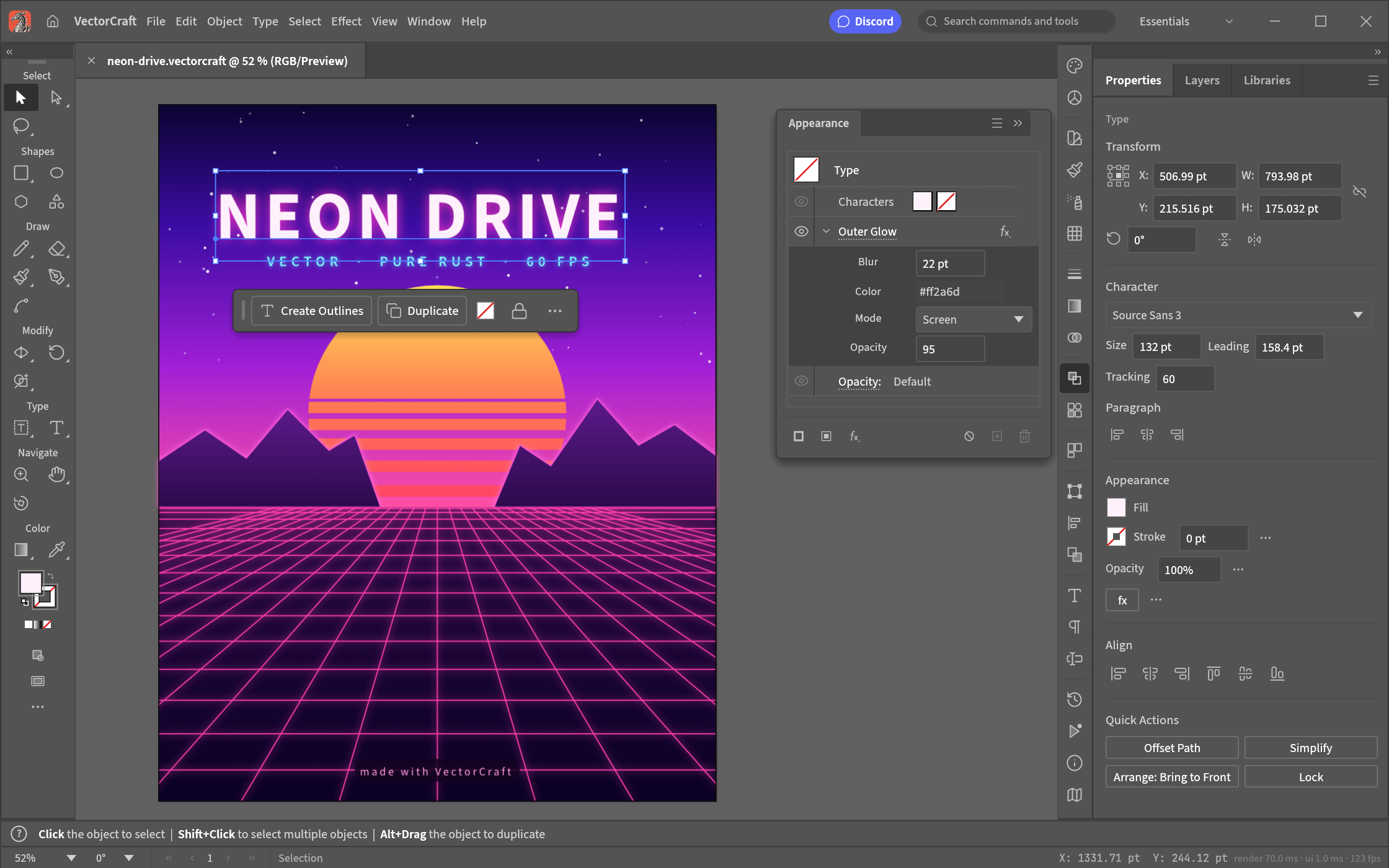
Let’s work towards one clear result: build an app icon from simple shapes. The aim is to keep something you can revise and something you can actually share, rather than learn every feature at once.
This walkthrough follows the developer’s public screens and menu descriptions. I have not run it myself, so the outputs below are expected results to verify, not a tested finished example. Keep the English menu names visible while following along; they also help when your installed version differs.
Before opening the project
Prepare: A simple icon made from a rectangle and a circle. Start without text or elaborate effects so the outline is easy to check.
Check the official app page and release downloads for a build matching your operating system and CPU. If there is no suitable installer or the app does not start, read Get started/Quick start and known issues in the official README. Record the app version and OS when you try the task.
Use copies for the exercise and keep originals, working documents and exports in distinguishable folders. The documented stage is alpha / in development. Check the article’s source date against your installed version if a menu or supported format has changed.
Find the relevant controls
| Where to look | What it does |
|---|---|
| Artboard | Define the area you will export. |
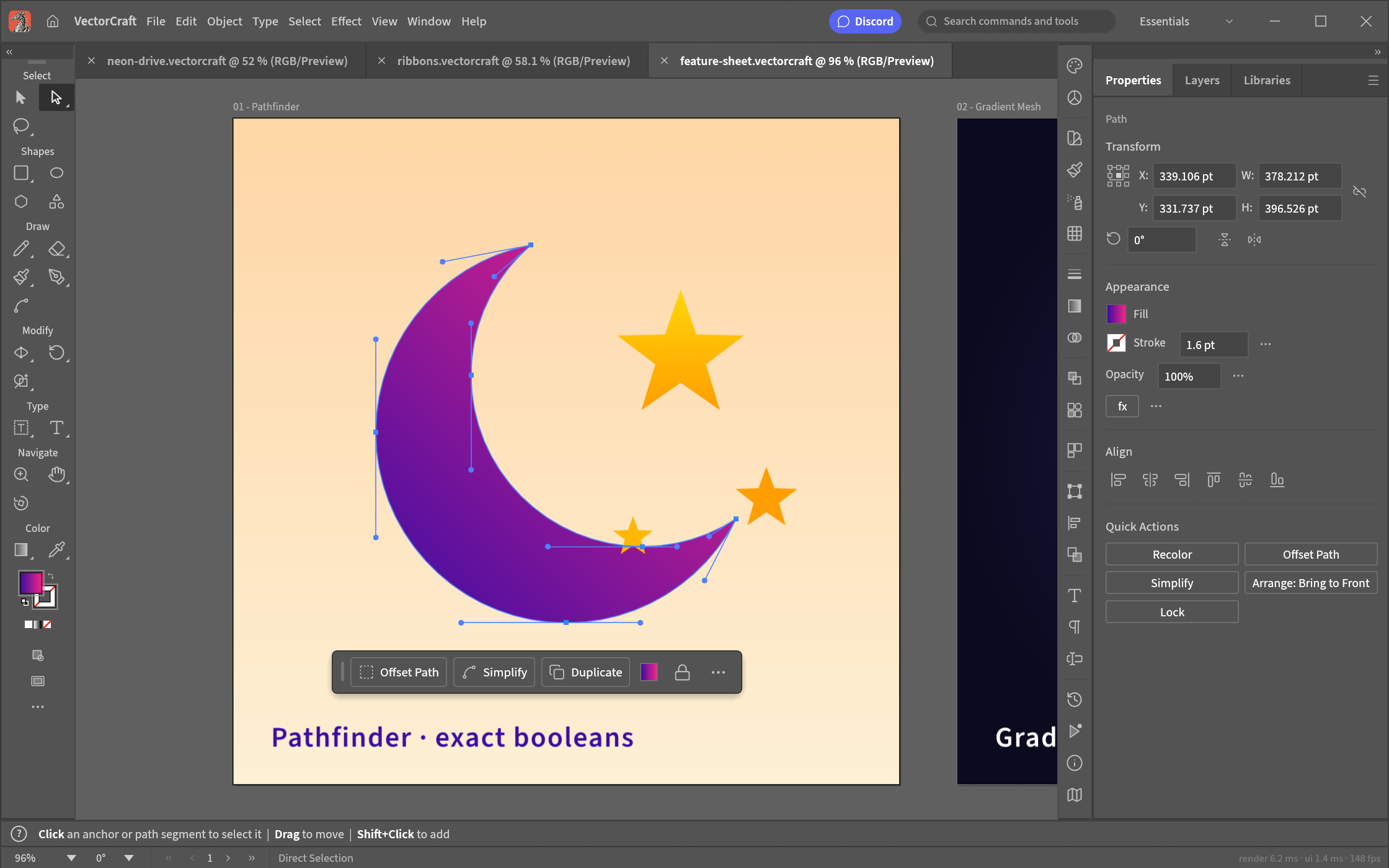
| Shapes and Direct Selection | Build the large outline, then refine points and curve handles. |
| Appearance and Properties | Check fills, strokes, lettering and effects. |
Example settings
| Setting | Example |
|---|---|
| Artboard | 512×512 px |
| Example colours | Dark green and cream |
| Small preview | 32×32 px |
| Deliverables | SVG and PNG, plus the editable document |
Follow the task
1. Create the artboard
Use File → New… for a 512×512 work area. For an existing vector file, use File → Open… instead. Treat those as separate tests if you are evaluating file exchange.
2. Place two large shapes
Draw a rectangle and an ellipse. Use the rectangle as a background and put the circular symbol in the centre. Leave text and complex effects out of the first attempt.
3. Combine or subtract shapes
Select both objects and apply the appropriate Pathfinder operation. Use undo if the outline is wrong. For an icon with a hole, subtract the overlapping area rather than covering it with a background-coloured shape.
4. Refine the paths
Use Direct Selection to pick anchors and adjust curve handles. Check for unwanted corners. In Properties, inspect the fill and stroke width separately from the path geometry.
5. Inspect the small version
Reduce the preview to 32×32. Check whether the main silhouette is still recognisable. Remove a decoration or adjust its thickness if it becomes an indistinct patch.
6. Save vectors and a preview
Keep the editing document, then use Export As SVG… and Export As PNG…. Open the SVG elsewhere to check paths, text and clipping; inspect the PNG at its intended small size.
Expected output and the next small revision
A PNG is a pixel preview; it does not preserve editable curve handles. Keep the native vector document for revision and a separate SVG for exchange. For the SVG, check font dependencies, gradients and clipping in the recipient’s actual app. Save a separate working copy before an important combine/subtract operation so there is a clear version to return to.
Creating a new SVG can start with a small shape exercise. Continuing a client’s Illustrator document needs a real-file test first. Check both the visual result and whether one anchor point can still be edited after reopening; those are two different completion criteria.
If you get stuck
If the exported outline looks different, separate the path itself from stroke thickness and clipping. If text changes, check font availability and letter spacing. For .ai exchange, use the real delivery file and record which layers and effects remain editable. A successful simple icon does not resolve that separate compatibility question.
Keep the last working copy separate from the problem file. Record the exact error and the step where it appeared. Changing several settings at once makes the cause harder to find. If you replace an input file, note that it is a different test rather than declaring the original successful.
Check before scaling up
- Export the same SVG curves, clipping and gradients from both apps.
- Use the same font and letter spacing, then inspect SVG/PDF layout.
- Use a real .ai file and record lost editing data and the remaining editable range.
When delivering the same icon at several sizes, distinguish document coordinates from exported image dimensions. Outer padding changes how the icon sits in a real interface. Establish a recognisable small outline first, and specify the editable document and the delivery file separately when exploring command-based production.
Introduction · Task tutorial · Comparison: documented differences
Sources & further reading
- https://getartcraft.com/apps/vectorcraft
- https://github.com/storytold/vectorcraft/blob/main/README.md
- https://www.adobe.com/products/illustrator.html
- https://github.com/storytold/vectorcraft/blob/a06717777828867557d759c674283304f63c04ae/README.md
- https://github.com/storytold/vectorcraft/blob/a06717777828867557d759c674283304f63c04ae/crates/ui-egui/src/menus.rs