FigCraft tutorial: make a mobile home screen from a template
A documented, six-step guide to make a mobile home screen from a template, with source screenshots, editable files and output checks.
Last updated
Menus and supported features can change. Compare the source-check date below with your current app version.
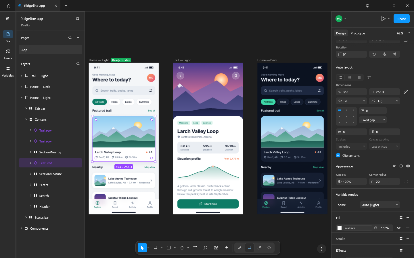
Let’s work towards one clear result: make a mobile home screen from a template. The aim is to keep something you can revise and something you can actually share, rather than learn every feature at once.
This walkthrough follows the developer’s public screens and menu descriptions. I have not run it myself, so the outputs below are expected results to verify, not a tested finished example. Keep the English menu names visible while following along; they also help when your installed version differs.
Before opening the project
Prepare: A mobile-app template, a short heading, button wording and two cards. Include a longer Korean string if that is what the eventual interface will use.
Check the official app page and release downloads for a build matching your operating system and CPU. If there is no suitable installer or the app does not start, read Get started/Quick start and known issues in the official README. Record the app version and OS when you try the task.
Use copies for the exercise and keep originals, working documents and exports in distinguishable folders. The documented stage is early alpha. Check the article’s source date against your installed version if a menu or supported format has changed.
Find the relevant controls
| Where to look | What it does |
|---|---|
| Layers | See how cards, buttons and text are grouped. |
| Design and Auto layout | Inspect padding, gaps and size rules. |
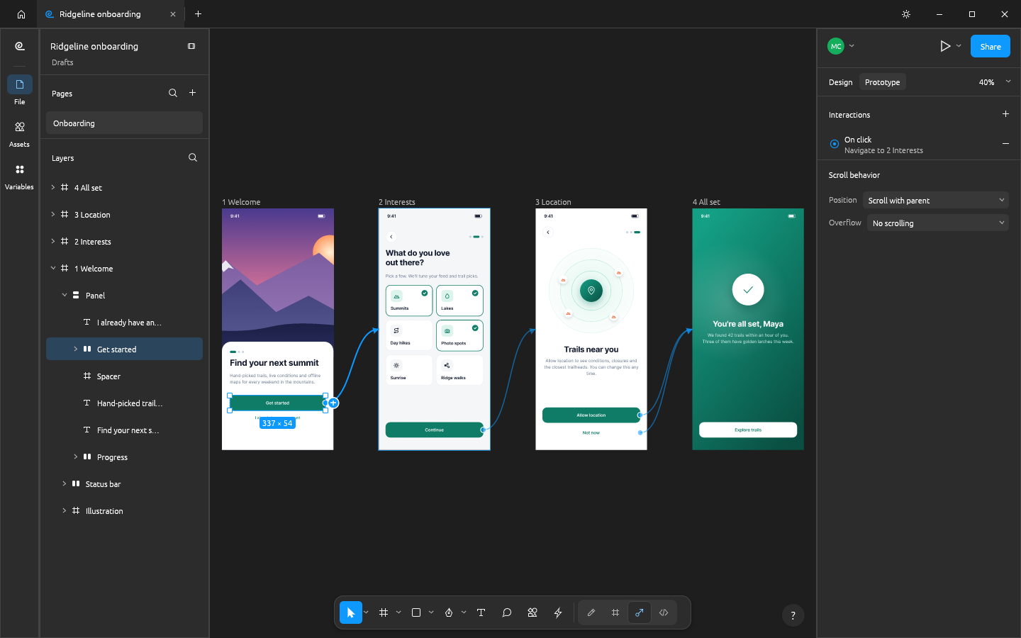
| Prototype | Connect a click action to its destination frame. |
Example settings
| Setting | Example |
|---|---|
| Start | Templates → mobile app |
| Example heading | Today’s recommendations |
| Cards | Two |
| Layout check | Shift+A and a deliberately long title |
Follow the task
1. Open a template
Choose a mobile app on the home screen’s Templates tab or use File → New from template…. This is the start route described in the public README.
2. Select the home frame
Find the home-screen frame in Layers. Change its title text and shorten the button label. Check that you are editing the intended text layer rather than moving the whole frame.
3. Group card content
Select the elements within a card and use Shift+A for Auto layout. Adjust direction, padding and gaps. Fixed holds a size, Hug fits content and Fill uses available space.
4. Test longer wording
Make the card heading long enough to wrap to about two lines. Inspect overlap or clipping. Separate a fixed-height problem from padding or an inappropriate Fill/Hug combination.
5. Connect navigation
If a second screen is needed, select the button and use Prototype. Set On click → Navigate to the intended frame and run the presentation view to check the destination.
6. Keep image and document
Export the frame as PNG and save the editing document. A PNG is a screen image, not a running app. For .fig exchange, separately check whether variables, components and connections remain.
Expected output and the next small revision
The editable design holds layout rules and reusable objects; the PNG only shows the rendered screen. Reopen the document and change a card heading again. Confirm that padding and grouping still work and that the prototype leads to the intended frame. A screenshot cannot demonstrate that a component or variable remains editable.
A local home screen is a manageable first test. Transferring a team design system requires checking .fig variables, components and prototype links, plus the collaboration and permission model. Two screenshots cannot establish concurrent editing, undo behaviour or successful recovery after a disconnected editor reconnects.
If you get stuck
For clipped wording, inspect the text-box size and card height first. Adjust padding and spacing one at a time. If a button opens the wrong screen, inspect the On click → Navigate target. Figma plug-ins, team permissions and collaboration reconnection are separate compatibility issues, not something a successful template edit resolves.
Keep the last working copy separate from the problem file. Record the exact error and the step where it appeared. Changing several settings at once makes the cause harder to find. If you replace an input file, note that it is a different test rather than declaring the original successful.
Check before scaling up
- Use identical long Korean wording and compare Auto layout and component sizes.
- Check simultaneous edits, undo and reconnection with two editors.
- Record missing variables, components and prototype links in the same .fig file.
Judge the screen with real wording, not just short placeholder text. A component that handles a long Korean title may need different size rules from a fixed decorative card. If testing collaboration later, use two editors and record simultaneous changes, undo and reconnection separately from the exported image.
Introduction · Task tutorial · Comparison: documented differences
Sources & further reading
- https://getartcraft.com/apps/figcraft
- https://github.com/storytold/figcraft/blob/main/README.md
- https://www.figma.com/design/
- https://github.com/storytold/figcraft/blob/bcedfeba1079829fd96c3b38077cfcc76e03bb09/README.md
- https://github.com/storytold/figcraft/blob/bcedfeba1079829fd96c3b38077cfcc76e03bb09/crates/engine/src/keymap.rs